Words matter in business writing


Today’s blog read comes from Ryan Lundquist, a good friend with social media prowess and influence, who writes about avoiding subjective language in the real estate appraisal industry.

Ryan hits the nail squarely on the head. The use of subjective language in business writing creates opportunities for miscommunication. The miscommunication can cause a reader to come to a misunderstanding. In the appraisal industry, an extreme example of misunderstanding could result in claims of classism, elitism, and racism.

Check out his blog post “Just say no to subjective language in real estate” to see how he champions the technical communicator’s tools of accuracy and clarity in writing. See how you might translate this to your own profession.

Understand the difference between objective language and subjective language. Examine your own writing for unintentional subjective language.

Words matter. Write on?

Finishing what I started


Did you know that I struggle with finishing things that I start?

I start a lot of things, but seldom finish them. I have countless journal pages with outlines for posts that I never finished. I have projects in the garage with all the pieces, one or two steps completed, but not finished. I have books on my shelf with bookmarks wedged somewhere in the first few chapters, but not finished.

That’s it. Today I take a stand. I’m committing myself. Today I’m going to fini

The ABCs of good communication just got an “F”


Why the heck do we communicate information? Answer that question correctly and you win. Win your audience, that is.

But waste their time by creating useless, inaccurate, wordy, muddled, ugly, purposeless, and hard-to-find content and you will have bought a ticket to unemployment. So how can you ensure you don’t waste your audience’s time?

Follow these ABCs of good communication:

A is for accuracy – Research every fact and conclusion you make. Rely on SMEs (subject matter experts) and check sources.

B is for brevity – Be brief. Edit ruthlessly. Make every paragraph, every sentence, and every word earn its right to be.

C is for clarity – Eliminate misunderstood words. Write phrases that can be understood by a 5th grade-level reader. (You’re not “dumbing it down.” You’re making sure all levels Continue reading

Perfectionism is killing me


I’m a closet perfectionist. It’s in my DNA.

The danger of perfectionism is that nothing gets completed. Sure, I get work done, but that often leads to me tweaking and refining and perfecting and revising and reworking and never reaching the point where I am satisfied.

Because I’m shooting for the perfect, when I should be shooting for the good.

Funny thing is I just read about it in this post by ProBlogger Darren Rowse, “Perfectionism: the ultimate time drain?”

You should have seen how much angst I put myself through just getting this post started, written, and finished.

There.

Draw me a picture (at SXSW)


Not able to attend SXSW (the South by SouthWest conference), I have to live vicariously through the tweets, blog posts, slideshares, and other conference notes from attendees who happen to be among my social media contacts.

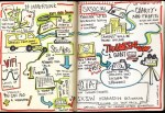
So, this set of hand-drawn notes by ad agency Ogilvy appeals to me on several angles.

First, it’s visual. Colorful. Image-based, more than text-based content.

Second, it’s good for business. Clever that this agency differentiated itself from others, the illustrations open potential business opportunities for Ogilvy, simply because presenters and followers who request a free 11×17″ print might linger, browse, and perhaps do business with Ogilvy.

Third, it’s cleverly different. Unlike the presentations posted on other sites, notes posted on blogs, and photos and tweets, this visualization of the content got my attention.

Prepare to be visually fascinated!
See http://ogilvynotes.com/

What tech can’t you live without?


Quick. What’s the one technology you can’t live without? Not a day goes by without you using it.

Is it your laptop or desktop computer? HD TV? cell phone? digital camera? GPS device? satellite radio? hand-held game? eBook reader? personal health monitor? universal language translator? transporter? (Oh-ooops, not supposed to tell anyone about that one yet.) Continue reading

A Post a Week in 2011


I want to blog more.
But instead of just thinking about it and saying it, I’m going to do it.
I will post to my blog at least once a week for all of 2011.

Now, I know why my blogging has tailed off in the past few years. When I first began blogging in 2004, there were fewer challengers to my time. But in the last few years, I’ve added social networking through Facebook, business networking through LinkedIn, microblogging through Twitter, and photoblogging through Tumblr.
I’ve graduated from a simple cellphone to an iPhone with all its distractions.
So, my blogging here dropped off.

This year, I’m taking the WordPress challenge. I’m making use of WordPress’ The Daily Post to help me along the way.

If I need help, I get to ask for it. If I can help someone else, I promise to volunteer.

I hope you encourage me with comments and likes.

Here’s to a new 2011.

10 Errors that Drive Me Crazy


Not another list of 10! This one from “Chip’s Blog,” of MacGregor Literary, captures errors that drive an editor crazy.
Chip

My favorite is list item number five.

Worthy of more than a quick retweet, this entry found its way to me on Twitter, thanks to Susannah W Freeman, WriteitSideways.

The art of the focal point


“Every good design needs a focal point.” Garr Reynolds begins in this meaty blog post.

Explaining “Tokonoma,” Garr moves from the Japanese architectural and cultural explanation, into the realm of practical application in—of all things—presentations. He takes the real-life, explains the concepts, and turns them back into the real life.

Brilliantly depicting before and after examples of presentation images, Garr shows examples that my most-practical and literal-minded followers can swallow.

I encourge you to apply the principles if you do any of the following:

  • create presentations and training visuals
  • design living spaces or workspaces
  • create visual communications (even the most-basic e-mail!)
  • Read his post on presentationzen.com.

E-mail signature blocks. How to.


Kat Neville writes on Smashing Magazine “The Art and Science of the Email Signature.

Nice work. Too many of my friends and coworkers have loaded down their signatures with every number, every tagline, every graphic logo of the company, in every color in the company-approved brand palette.

Brevity. Clarity.

That’s all recipients want.

Also, if the majority of your email is sent inhouse, then create an internal signature that’s your default.

Name, Extension.

Period.

No need to tell your coworkers the name of the company you both work for, your own Web site, and monthly Marketing tagline.

Speaking of company brand, the pastel colors some companies include in their palette are instant turnoffs. Try reading this: andy gee, communication specialist

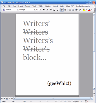
How to break writer’s block – the conclusion


writersblock
I promised a follow-up blog post about the writer who was suffering from writer’s block. Today, the conclusion of our story.

“Jay’s” piece went through a 3-level approval process, yet escaped with very minimal changes from the reviewers!

Her biggest challenge was in reducing word count! Remember that her initial problem was just getting started!

Her second challenge was selecting a title. Remember that the title was the piece she was initially stuck on. Our writer’s block breaking tactic allowed her to skip the title, get started on the content, and come back to the title later in the process. (NOTE: seldom do I start with a title or working headline. I also save my introductory paragraphs until the end, after I’ve developed my major points and conclusion. Only then, do I go back and write the opening paragraph. Think of that writing strategy for a moment, how else will I know where I’m going until I’ve gotten there first? I’ll wait for you to process that.)

I read her final piece, which listed three challenges and identified the strategies to overcome each challenge. The piece flowed, displayed a logical organization, and read with a tight writing style. Its final title made sense and captured the flavor of the full content.

In summary, Jay’s final piece came in at 3 pages, about 37 paragraphs, with a word count of 1,440 words.

Success story!

Related posts:

5 Rules for Better Web Writing


5rulesMashable.com’s Josh Catone clearly practices what he preaches when he writes the “5 Rules for Better Web Writing.”

  • For seasoned technical writers, this is nothing new.
  • For newbies and my practicing students who are thrust into the world of technical writing for the Web, pay heed.