Caine’s Arcade – a boy and a dream go viral


Imagination. Innovation. Incredible power of social media.

A 9-year-old boy in Los Angeles with a big dream and tons of creativity spends his summer building an arcade out of leftover cardboard, hoping customers to his dad’s auto parts shop will stop and play.

But in this day of online shopping, his dad’s customers shop by mouse click, not by foot.

No one stops to play.

Until one day, a customer shopping for a car door handle stops to play, buys the fun pass, and becomes enamored with the boy’s imagination, innovation, and incredible execution.

That customer, Nirvan Mullick, dreams another big dream, and the rest of the story is how videos go viral.

Watch.

Postscript: More than $100,000 has been donated to a trust fund for Caine’s college education. Imagine the technological wizardry to come from this boy’s imagination.

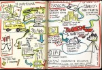
Draw me a picture (at SXSW)


Not able to attend SXSW (the South by SouthWest conference), I have to live vicariously through the tweets, blog posts, slideshares, and other conference notes from attendees who happen to be among my social media contacts.

So, this set of hand-drawn notes by ad agency Ogilvy appeals to me on several angles.

First, it’s visual. Colorful. Image-based, more than text-based content.

Second, it’s good for business. Clever that this agency differentiated itself from others, the illustrations open potential business opportunities for Ogilvy, simply because presenters and followers who request a free 11×17″ print might linger, browse, and perhaps do business with Ogilvy.

Third, it’s cleverly different. Unlike the presentations posted on other sites, notes posted on blogs, and photos and tweets, this visualization of the content got my attention.

Prepare to be visually fascinated!
See http://ogilvynotes.com/

Touchscreen or keyboard?


As designers add tactile touchscreen interfaces to devices, some debate the ease of use.

Some users suffer from limited tactile sense control. Others struggle with the smaller size of the visual keys. Still others need the audible and tactile feedback from hardware keys.

Would these hacks solve those user interface problems?

Discovered at socialjunjun.typepad.com/.

PowerPoint Comedy of Errors


UPDATE 2010: Don McMillan updated his comedy bit for 2010! (first posted in 2007…)

How many errors can you find in this PowerPoint show? Making the rounds on video sites is Don McMillan’s clever presentation, Life after Death by Powerpoint.
Did you spot the

Continue reading

How to say “I am sorry” to a designer


sorry.jpgI found this in my Stumbleupon wanderings:

swiss-miss.com/2010/02/im-sorry.html

Clever. Inside joke? Not if you use Windows shortcuts. Your designer will appreciate it.

Oh, it’s Command+Z to the designer, most likely a Mac user.

The art of the focal point


“Every good design needs a focal point.” Garr Reynolds begins in this meaty blog post.

Explaining “Tokonoma,” Garr moves from the Japanese architectural and cultural explanation, into the realm of practical application in—of all things—presentations. He takes the real-life, explains the concepts, and turns them back into the real life.

Brilliantly depicting before and after examples of presentation images, Garr shows examples that my most-practical and literal-minded followers can swallow.

I encourge you to apply the principles if you do any of the following:

  • create presentations and training visuals
  • design living spaces or workspaces
  • create visual communications (even the most-basic e-mail!)
  • Read his post on presentationzen.com.

Mixing Old School with today’s tech


old school TV w rabbit ears

rabbit ears and clicky dials

Blending contemporary technology with old school retro designs, these 10 tech finds will take you back to an era when “network” meant three channels and there was a USA but not a USB.
Posted on Mashable.
Hmmm, would you stand three inches over and hold onto the right antenna? Ahh, there.

E-mail signature blocks. How to.


Kat Neville writes on Smashing Magazine “The Art and Science of the Email Signature.

Nice work. Too many of my friends and coworkers have loaded down their signatures with every number, every tagline, every graphic logo of the company, in every color in the company-approved brand palette.

Brevity. Clarity.

That’s all recipients want.

Also, if the majority of your email is sent inhouse, then create an internal signature that’s your default.

Name, Extension.

Period.

No need to tell your coworkers the name of the company you both work for, your own Web site, and monthly Marketing tagline.

Speaking of company brand, the pastel colors some companies include in their palette are instant turnoffs. Try reading this: andy gee, communication specialist

VSP goes blue for diabetes!


From vspblog.com:

“To raise awareness about the connection between diabetes and eye health, VSP’s headquarters will be lit blue each night. VSP is proud to participate in this global event. Signs of diabetes can be seen in an eye exam before a person is even aware they have it.”

vsp-headquarters-turns-blue

And another fellow vspblogger wrote:

“World Diabetes Day is a global awareness campaign that’s celebrated every year on November 14. Iconic landmarks and buildings across the world are lit in blue to create a united voice for diabetes awareness!
Together we can shed light on the impacts of this growing disease and the need to find a cure.”

Read more from vspblog.com

The best camera to buy. Ever.


eye-to-eye with a lens

eye-to-eye with a lens

Because I’m often seen as a photographer, my friends sometimes ask me what can be done to improve their photos. And if their questions are about what equipment to buy, I often steer them first toward the debate regarding “photography = science + art.”

For those who haven’t heard that one, photography is a balance between two parts, science and art. The science : light, equipment, and mechanics. The art: composition, timing, light, balance and contrast, and story. My point? Too often, people concentrate on Continue reading

A fresh voice for vision


A redesigned VSP blog went live this past week with an intro by Liz B and a first blog entry by Vernon D. Liz is the group blog editor and Vernon is one of several guest bloggers from VSP.

All past blog entries from Rob Lynch are still there of course, but going forward, you can expect fresh, timely, relevant blog entries about eyecare and eye health, vision trends and news, the company and its people, and more.

The WordPress theme displays a three-column page design that is already packed with content. Continue reading

Header photo – time to cool off


With California in the midst of a heat wave and firefighters working round-the-clock shifts without days off, now’s a good time to update the geewhiz blog header photo. I know it offers no real relief, nor does it do anything for our men and women serving and protecting our lives and properties as they spend endless weeks away from families.

But with temperatures hovering near 110 in Sacramento, skies thick with smoke and soot, heat advisories, unhealthy air quality warnings, and more fire weather warnings
I just have to give your eyes a welcome virtual dip in the pool.

That’s Bob in the lead, 50 freestyle.

This blog entry may not make sense in five months, but it serves its purpose to educate first-time bloggers to blog customization features.

Related Post
New winter header photo (December 2007)